


Discover SieMatic colors for your ideal kitchen design
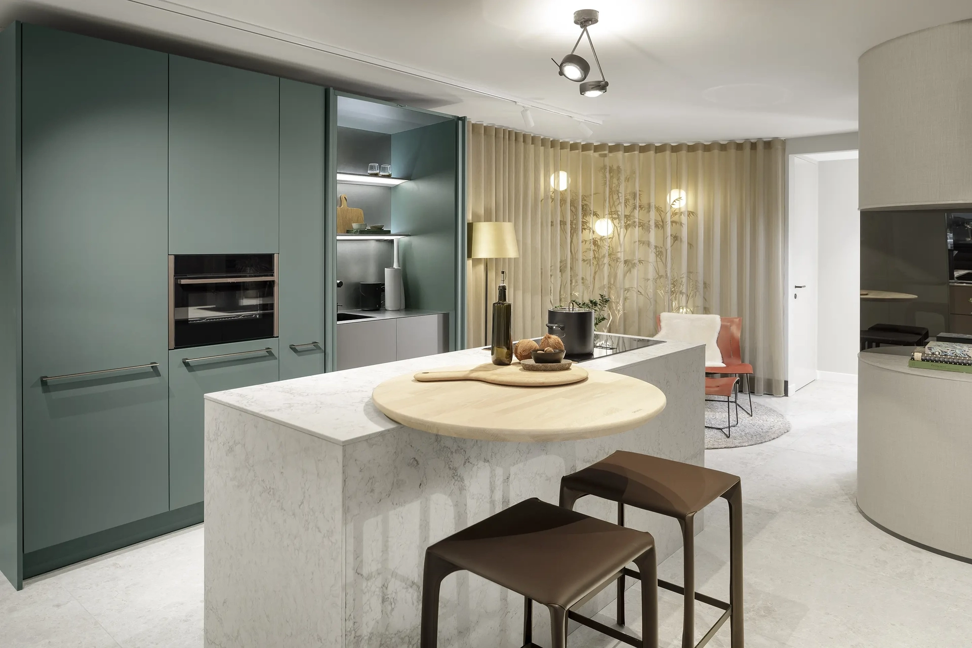
The extensive SieMatic color palette
Color plays a major role in how a kitchen is experienced. It influences the atmosphere, the sense of space, and the way materials are showcased. That’s why SieMatic developed the ColorSystem: a carefully curated color palette that complements various living styles, materials, and interior design concepts. The collection consists of colors that can be harmoniously combined with one another and easily coordinated with elements outside the kitchen, such as floors, wall finishes, and furniture. This creates a design that does not stand alone but becomes an integral part of the overall living space.
Warm and Neutral Color Palettes
Within the SieMatic ColorSystem, warm and neutral colors form the basis of the design. Warm shades such as Silk, Elephant, and Mokka bring softness and tranquility to the space. These colors pair well with natural materials like wood veneer and create a welcoming atmosphere. Neutral colors such as Lotus White, Shadow, and Graphite, on the other hand, provide clarity, contrast, and a more architectural look. They form a calm foundation and allow other materials and details to stand out more prominently. By thoughtfully incorporating both color palettes, you can create a kitchen that complements the desired atmosphere of your home.

Lotus White

Silk

Sahara Beige

Agate Gray

Elephant

Stone Gray

Shadow

Quartzite Green

Caviar Green

Jade

Oyster Gray

Mocha

Graphite

Black
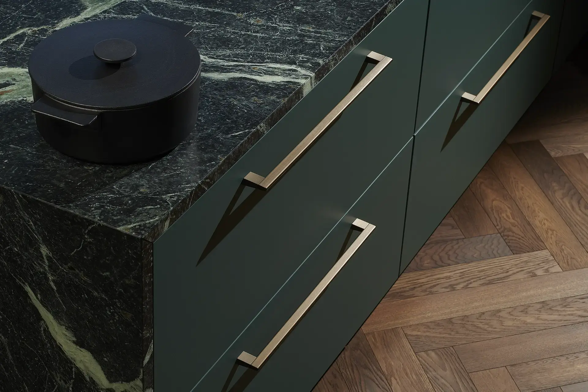
More nuance in the color palette
In addition to the familiar basic collection, the color palette includes several new colors that add extra nuance to the design. Colors such as Jade and Oyster Gray create a soft, natural look, while Quartzite Green and Caviar Green add more depth and contrast. These colors were developed to work well with materials such as wood veneer, metal, stone, and ceramics. This creates more possibilities for tone-on-tone designs, subtle contrasts, and bold material combinations. Which color is the best fit ultimately depends on the desired atmosphere, lighting conditions, and the materials used in the design.
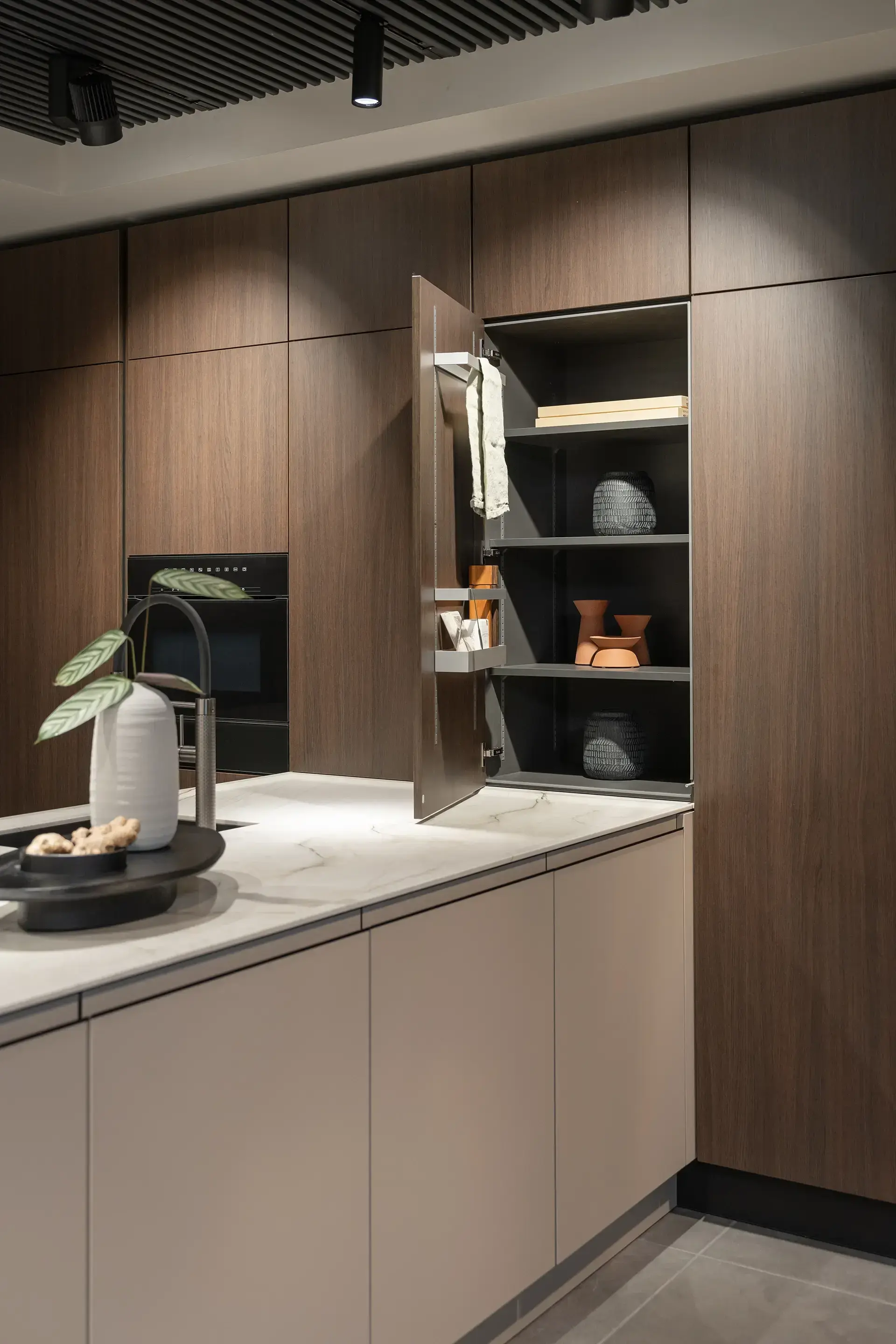
Color that extends to the interior of the cabinets
In a well-thought-out kitchen design, color doesn’t stop at the cabinet fronts. The interior of the cabinets plays a major role in the perception of quality, especially when you open the doors regularly or opt for glass display cabinets. That’s why we coordinate the interior colors of SieMatic cabinets with the chosen cabinet front. For example, with aluminum frame fronts, we use a white or dark gray back panel and cabinet body color. Upper cabinets with dark gray interiors are fitted with matching graphite-gray handle strips. This coordination prevents jarring transitions when you use the kitchen on a daily basis.
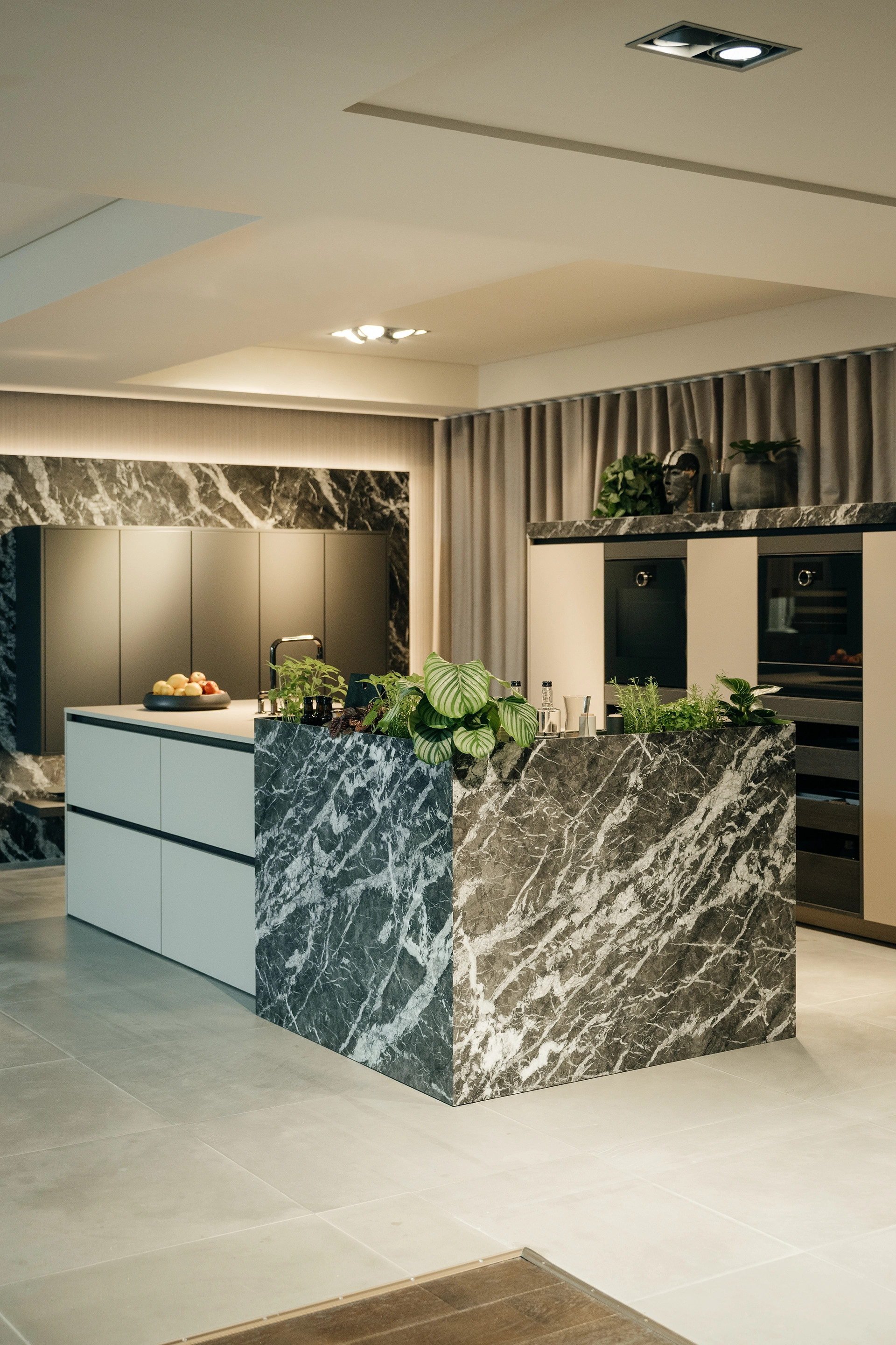
Color and Material
Combining colors with wood, stone, and metal
The power of color truly comes into its own when combined with materials. A warm shade can gain extra depth when paired with wood veneer, while a dark color contrasts beautifully with stone or ceramic. Metal, in turn, adds extra accents and reflection to the overall design. By carefully coordinating colors and materials, you create a kitchen where the focus is not just on the individual elements, but on the overall look. In a well-thought-out design, color doesn’t stop at the cabinet fronts. Interior colors, cabinet bodies, and details such as handle strips are also coordinated with the chosen color and material combination.
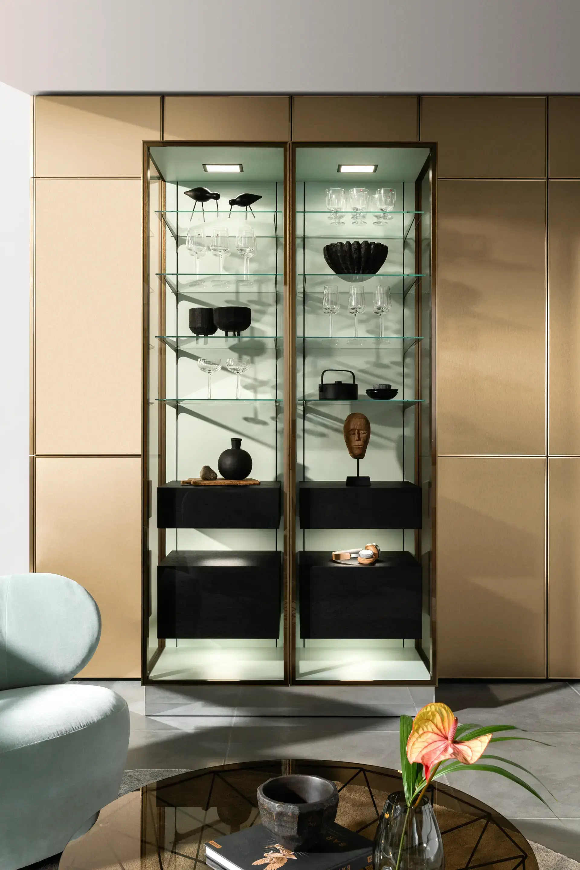

Color within the SieMatic style worlds
Each SieMatic style world uses color in its own unique way. Within PURE, the emphasis is often on calm color combinations, subtle contrasts, and a minimalist look. URBAN frequently combines color with metal and distinctive material textures. CLASSIC makes use of warmer tones and refined details, while MONDIAL offers scope for more expressive color and material combinations. The chosen color thus not only enhances the kitchen’s aesthetic but also complements the character of the entire living space.
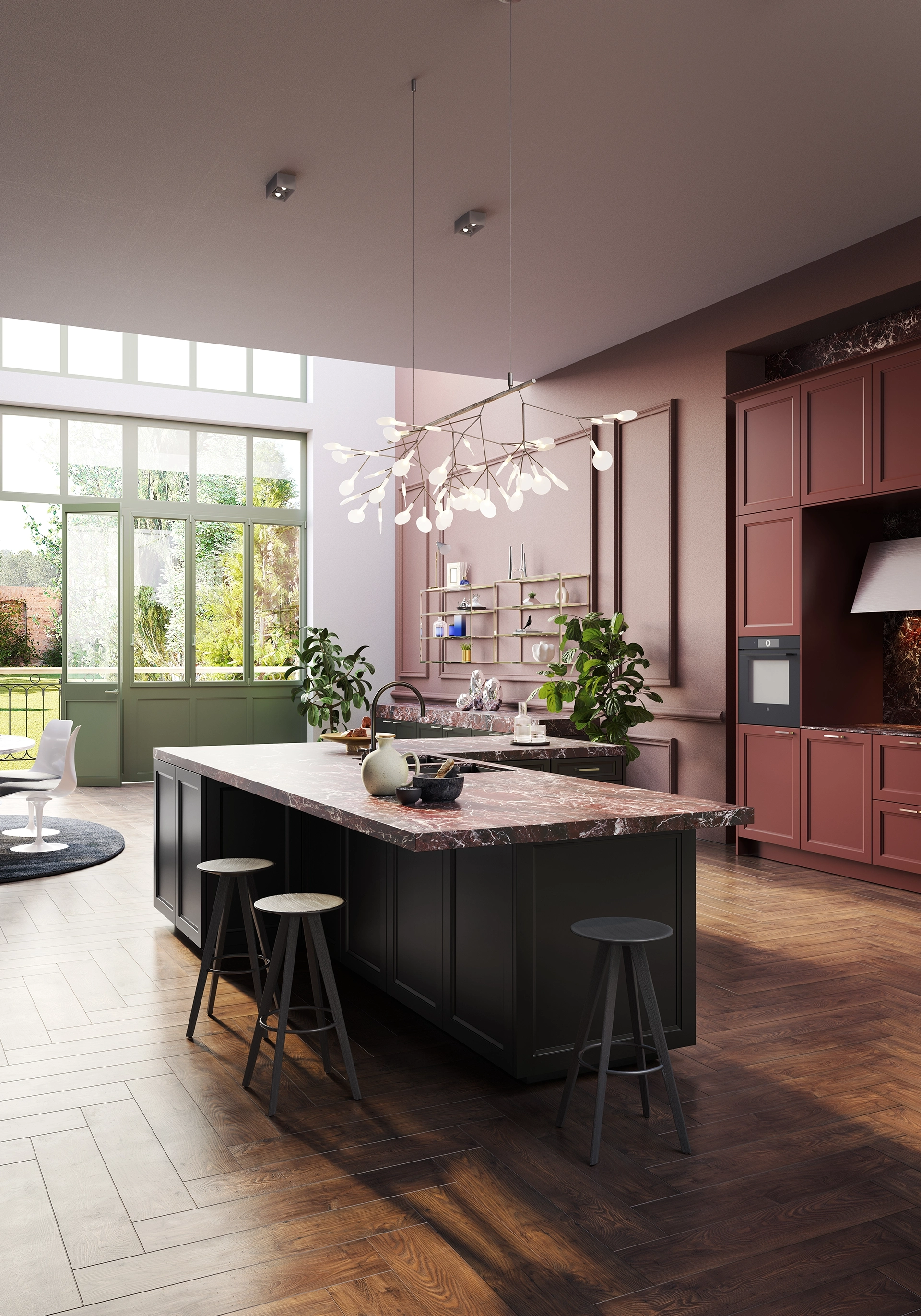
Individual Color Collection
Sometimes a design calls for a color that falls outside the standard palette. With the Individual Color Collection, SieMatic offers virtually unlimited design freedom. Cabinet fronts can be finished in approximately 1,950 NCS colors, available in both satin-matte and high-gloss lacquer. This makes it possible to precisely match a kitchen to a specific wall color, upholstery fabric, or other interior detail. Whether you opt for a subtle tone-on-tone approach or a striking color accent, the Individual Color Collection offers extra freedom in your design.

Ontdek de kleuren in het echt
Een kleur kan op ieder scherm anders overkomen. Lichtinval, omgeving en materiaal hebben grote invloed op hoe een kleur wordt ervaren. Met officiële SieMatic kleurstalen bekijk je de kleuren thuis in jouw eigen interieur en ontdek je welke tint het beste aansluit bij jouw woning.
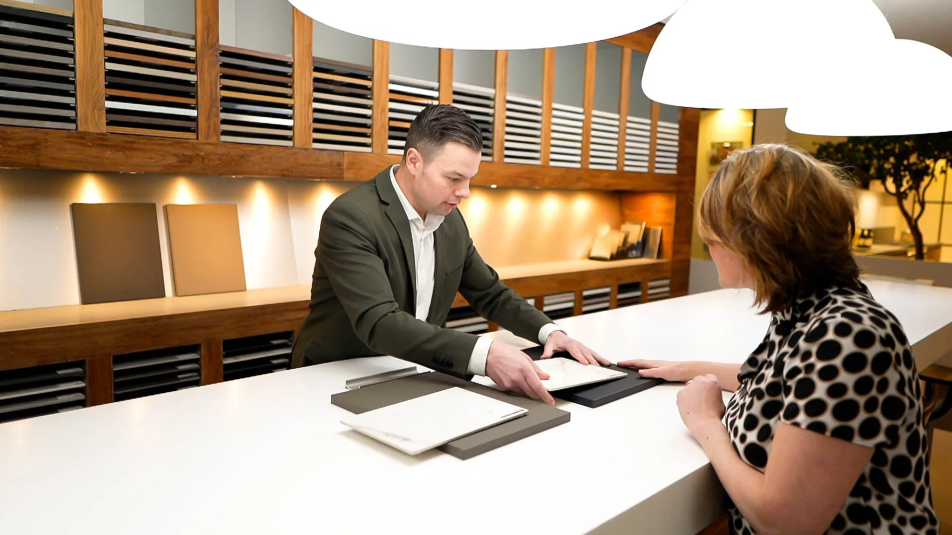
Personalized color advice in our SieMatic showrooms
It’s difficult to assess color on a screen. Lighting, material selection, and surface finishes have a major impact on how a color is ultimately perceived. In our SieMatic showrooms, you can view the different colors, combine them with materials, and evaluate them under a variety of lighting conditions. During a personal consultation, we’ll be happy to help you put together a color palette that suits your home, interior, and personal preferences.